Contents
Widgets
Widgets let you monitor the operation of the application.
Widgets are organized into widget groups, each one related to the analytics type they provide. The following widget groups and widgets are available in KUMA:
- Events—widget for creating analytics based on events.
- Active lists—widget for creating analytics based on active lists of correlators.
- Assets—group for analytics related to assets from processed events. This group includes the following widgets:
- Affected assets—table with information about the level of importance of assets and the number of unclosed alerts they are associated with.
- Affected asset categories—categories of assets linked to unclosed alerts.
- Number of assets—number of assets that were added to KUMA.
- Assets in incidents by tenant—number of assets associated with unclosed incidents. The grouping is by tenant.
- Assets in alerts by tenant—number of assets associated with unclosed alerts, grouped by tenant.
- Event sources—group for analytics related to sources of events. The group includes the following widgets:
- Top event sources by alerts number—number of unclosed alerts grouped by event source.
- Top event sources by convention rate—number of events associated with unclosed alerts. The grouping is by event source.
In some cases, the number of alerts generated by sources may be inaccurate. To obtain accurate statistics, it is recommended to specify the Device Product event field as unique in the correlation rule, and enable storage of all base events in a correlation event. However, correlation rules with these settings consume more resources.
- Users—group for analytics related to users from processed events. The group includes the following widgets:
- Affected users in alerts—number of accounts related to unclosed alerts.
- Number of AD users—number of Active Directory accounts received via LDAP during the period configured for the widget.
In the events table, in the event details area, in the alert window, and in the widgets, the names of assets, accounts, and services are displayed instead of the IDs as the values of the SourceAssetID, DestinationAssetID, DeviceAssetID, SourceAccountID, DestinationAccountID, and ServiceID fields. When exporting events to a file, the IDs are saved, but columns with names are added to the file. The IDs are also displayed when you point the mouse over the names of assets, accounts, or services.
Searching for fields with IDs is only possible using IDs.
Basics of managing widgets
The principle of data display in the widget depends on the type of the graph. The following graph types are available in KUMA:
- Pie chart (
 ).
). - Counter (
 ).
). - Table (
 ).
). - Bar chart (
 ).
). - Date Histogram (
 ).
). - Line chart.
Basics of general widget management
The name of the widget is displayed in the upper left corner of the widgets. By clicking the link with the name of the widget about events, alerts, incidents, or active lists, you can go to the corresponding section of the KUMA Console.
A list of tenants for which data is displayed is located under the widget name.
In the upper right corner of the widget, the period for which data is displayed on the widget is indicated ( ). You can view the start and end dates of the period and the time of the last update by hovering the mouse cursor over this icon.
The CSV button is located to the left of the period icon. You can download the data displayed on the widget in CSV format (UTF-8 encoding). The downloaded file name has the format <widget name>_<download date (YYYYMMDD)>_<download time (HHMMSS)>.CSV.
The widget displays data for the period selected in widget or layout settings only for the tenants that are selected in widget or layout settings.
Basics of managing "Pie chart" graphs
A pie chart is displayed under the list of tenants. You can left-click the selected segment of the diagram to go to the relevant section of the KUMA Console. The data in that section is sorted in accordance with the filters and/or search query specified in the widget.
Under the period icon, you can see the number of events, active lists, assets, alerts, or incidents grouped by the selected criteria for the data display period.
Examples:
|
Basics of managing "Counter" graphs
Graphs of this type display the sum total of selected data.
Example: The Number of assets widget displays the total number of assets added to KUMA. |
Basics of managing "Table" graphs
Graphs of this type display data in a table format.
Example: In the Events widget, for which the SQL query |
Basics of managing "Bar chart" graphs
A bar chart is displayed below the list of tenants. You can left-click the selected diagram section to go to the Events section of the KUMA Console. The data in that section is sorted in accordance with the filters and/or search query specified in the widget. To the right of the chart, the same data is represented as a table.
Example: In the a Netflow top internal IPs widget for which the SQL query |
Basics of managing "Date Histogram" graphs
A date histogram is displayed below the list of tenants. You can left-click the selected section of the chart to go to the Events section of the KUMA Console with the relevant data. The data in that section is sorted in accordance with the filters and/or search query specified in the widget. To the right of the chart, the same data is represented as a table.
Example: In the Events widget, for which the SQL query |
Basics of managing "Line chart" graphs
A line chart is displayed below the list of tenants. You can left-click the selected section of the chart to go to the Events section of the KUMA Console with the relevant data. The data in that section is sorted in accordance with the filters and/or search query specified in the widget. To the right of the chart, the same data is represented as a table.
Example: In the Events widget, for which the SQL query |
Special considerations for displaying data in widgets
Limitations for the displayed data
For improved readability, KUMA has limitations on the data displayed in widgets depending on its type:
- Pie chart displays a maximum of 20 slices.
- Bar chart displays a maximum of 40 bars.
- Table displays a maximum of 500 entries.
- Date histogram displays a maximum of 365 days.
Data that exceeds the specified limitations is displayed in the widget in the Other category.
You can download the full data used for building analytics in the widget in CSV format.
Summing up the data
The format of displaying the total sum of data on date histogram, bar chart and pie chart depends on the locale:
- English locale: decades (every three digits) are separated by commas, the decimal part is separated by a period.
- Russian locale: decades (every three digits) are separated by spaces, the decimal part is separated by a comma.
Creating a widget
You can create a widget in a dashboard layout while creating or editing the layout.
To create a widget:
- Create a layout or switch to editing mode for the selected layout.
- Click Add widget.
- Select a widget type from the drop-down list.
This opens the widget settings window.
- Edit the widget settings.
- If you want to see how the data will be displayed in the widget, click Preview.
- Click Add.
The widget appears in the dashboard layout.
Page topEditing a widget
To edit widget:
- In the KUMA Console, select the Dashboard section.
- Expand the list in the upper right corner of the window.
- Hover the mouse cursor over the relevant layout.
- Click the
 button.
The Customizing layout window opens.
- In the widget you want to edit, click
 .
. - Select Edit.
This opens the widget settings window.
- Edit the widget settings.
- Click Save in the widget settings window.
- Click Save in the Customizing layout window.
The widget is edited.
Page topDeleting a widget
To delete a widget:
- In the KUMA Console, select the Dashboard section.
- Expand the list in the upper right corner of the window.
- Hover the mouse cursor over the relevant layout.
- Click the button.
The Customizing layout window opens.
- In the widget you want to delete, click .
- Select Delete.
- This opens a confirmation window; in that window, click OK.
- Click the Save button.
The widget is deleted.
Page top"Events" widget
You can use the Events widget to get analytics based on SQL queries.
When creating this type of widget, you must set values for the following settings:
The  tab:
tab:
- Graph is the type of the graph. The following graph types are available:
- Pie chart.
- Bar chart.
- Counter.
- Line chart.
- Table.
- Date Histogram.
- Tenant is the tenant for which data is displayed in the widget.
You can select multiple tenants.
By default, data is displayed for tenants that have been selected in layout settings.
- Period is the period for which data is displayed in the widget. The following periods are available:
- As layout means data is displayed for the period selected for the layout.
This is the default setting.
- 1 hour—data is displayed for the previous hour.
- 1 day—data is displayed for the previous day.
- 7 days—data is displayed for the previous 7 days.
- 30 days—data is displayed for the previous 30 days.
- In period—data is displayed for a custom time period.
If you select this option, use the opened calendar to select the start and end dates of the period and click Apply Filter. The date and time format depends on your operating system's settings. You can also manually change the date values if necessary.
The upper boundary of the period is not included in the time slice defined by it. In other words, to receive analytics for a 24-hour period, you should configure the period as Day 1, 00:00:00 – Day 2, 00:00:00 instead of Day 1, 00:00:00 – Day 1, 23:59:59.
- As layout means data is displayed for the period selected for the layout.
- Show data for previous period—enable the display of data for two periods at the same time: for the current period and for the previous period.
- Storage is the storage that is searched for events.
- The SQL query field (
 ) lets you manually enter a query for filtering and searching events.
You can also create a query in Builder by clicking
.How to create a query in Builder
To create a query in Builder:
- Specify the values of the following parameters:
- SELECT—event fields that should be returned. The number of available fields depends on the selected graph type.
- In the drop-down list on the left, select the event fields for which you want to display data in the widget.
- The middle field displays what the selected field is used for in the widget: metric or value.
If you selected the Table graph type, in the middle fields, you must specify column names using ANSII-ASCII characters.
- In the drop-down list on the right, you can select an operation to be performed on the data:
- count—event count. This operation is available only for the ID event field. Used by default for line charts, pie charts, bar charts, and counters. This is the only option for date histogram.
- max is the maximum value of the event field from the event selection.
- min is the minimum value of the event field from the event selection.
- avg is the average value of the event field from the event selection.
- sum is the sum of event field values from the event selection.
- SOURCE is the type of the data source. Only the events value is available for selection.
- WHERE—conditions for filtering events.
- In the drop-down list on the left, select the event field that you want to use for filtering.
- Select the necessary operator from the middle drop-down list. The available operators depend on the type of value of the selected event field.
- In the drop-down list on the right, enter the value of the condition. Depending on the selected type of field, you may have to manually enter the value, select it from the drop-down list, or select it on the calendar.
You can add search conditions by clicking Add condition or remove search conditions by clicking
 .
.You can also add groups of conditions by clicking Add group. By default, groups of conditions are added with the AND operator, but you can change the it if necessary. Available values: AND, OR, NOT. Group conditions are deleted by clicking the Delete group button.
- GROUP BY—event fields or aliases to be used for grouping the returned data. This parameter is not available for Counter graph type.
- ORDER BY—columns used as the basis for sorting the returned data. This parameter is not available for the Date Histogram and Counter graph types.
- In the drop-down list to the left, select the value that will be used for sorting.
- Select the sort order from the drop-down list on the right: ASC for ascending, DESC for descending.
- For Table type graphs, you can add sorting conditions by clicking Add column.
- LIMIT is the maximum number of data points for the widget. This parameter is not available for the Date Histogram and Counter graph types.
- SELECT—event fields that should be returned. The number of available fields depends on the selected graph type.
- Click Apply.
Example of search conditions in the query builder
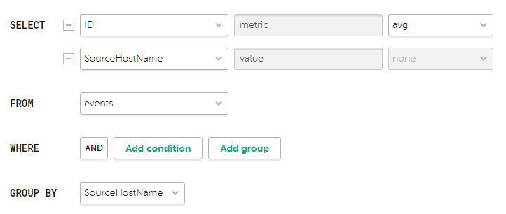
Search condition parameters for the widget showing average bytes received per host
The "metric" and "value" aliases in SQL queries cannot be edited for any type of event analytics widget, except tables.
Aliases in widgets of the Table type can contain Latin and Cyrillic characters, as well as spaces. When using spaces or Cyrillic, the alias must be enclosed in quotation marks:
"An alias with a space",`Another alias`.When displaying data for the previous period, sorting by the
count(ID)parameter may not work correctly. It is recommended to sort by the metric parameter. For example,SELECT count(ID) AS "metric", Name AS "value" FROM `events` GROUP BY Name ORDER BY metric ASC LIMIT 250.In the Counter type widgets you must specify the method of data processing for the values of the
SELECTfunction:count,max,min,avg,sum. - Specify the values of the following parameters:
The  tab:
tab:
The tab is displayed if on the tab in the Graph field you have selected one of the following values: Bar chart, Line chart, Date Histogram.
- The Y-min and Y-max values set the scale of the Y axis.
- The X-min and X-max values set the scale of the X axis.
Negative values can be displayed on chart axes. This is due to the scaling of charts on the widget and can be fixed by setting zero as the minimum chart values instead of Auto.
- Line-width is the width of the line on the graph. This field is displayed for the "Line chart" graph type.
- Point size is the size of the pointer on the graph. This field is displayed for the "Line chart" graph type.
The  tab:
tab:
- Name is the name of the widget.
- Description is the description of the widget.
- Color is a drop-down list where you can select the color for displaying information:
- default for your browser's default font color
- green
- red
- blue
- yellow
- Horizontal makes the histogram horizontal instead of vertical.
When this option is enabled, when a widget displays a large amount of data, horizontal scrolling is not available and all available information is fit into the fixed size of the widget. If there is a lot of data to display, it is recommended to increase the widget size.
- Show total shows sums total of the values.
- Legend displays a legend for analytics.
The toggle switch is turned on by default.
- Show nulls in legend displays parameters with a null value in the legend for analytics.
The toggle switch is turned off by default.
- Decimals—the field to enter the number of decimals to which the displayed value must be rounded off.
- Period segments length (available for graphs of the Date Histogram type) sets the length of segments into which you want to divide the period.
"Active lists" widget
You can use the Active lists widget to get analytics based on SQL queries.
When creating this type of widget, you must set values for the following settings:
The tab:
- Graph is the type of the graph. The following graph types are available:
- Bar chart.
- Pie chart.
- Counter.
- Table.
- Tenant is the tenant for which data is displayed in the widget.
You can select multiple tenants.
By default, data is displayed for tenants that have been selected in layout settings.
- Correlator is the name of the correlator that contains the active list for which you want to receive data.
- Active list is the name of the active list for which you want to receive data.
The same active list can be used by different correlators. However, a separate entity of the active list is created for each correlator. Therefore, the contents of the active lists used by different correlators differ even if the active lists have the same names and IDs.
- The SQL query field lets you manually enter a query for filtering and searching active list data.
The query structure is similar to that used in event search.
When creating a query based on active lists, you must consider the following:
- For the FROM function, you must specify the `records` value.
- If you want to receive data for fields whose names contain spaces and Cyrillic characters, you must also enclose such names in quotes in the query:
- In the SELECT function, enclose aliases in double quotes or backticks: "alias", `another alias`.
- In the ORDER BY function, enclose aliases in backticks: `another alias`.
- Event field values are enclosed in straight quotes: WHERE DeviceProduct = 'Microsoft'.
Names of event fields do not need to be enclosed in quotes.
If the name of an active list field begins or ends with spaces, these spaces are not displayed by the widget. The field name must not contain spaces only.
If the values of the active list fields contain trailing or leading spaces, it is recommended to use the LIKE '%field value%' function to search by them.
- In your query, you can use service fields: _key (the field with the keys of active list records) and _count (the number of times this record has been added to the active list), as well as custom fields.
- The "metric" and "value" aliases in SQL queries cannot be edited for any type of active lists analytics widget, except tables.
- If a date and time conversion function is used in an SQL query (for example, fromUnixTimestamp64Milli) and the field being processed does not contain a date and time, an error will be displayed in the widget. To avoid this, use functions that can handle a null value. Example: SELECT _key, fromUnixTimestamp64Milli(toInt64OrNull(DateTime)) as Date FROM `records` LIMIT 250.
- Large values for the LIMIT function may lead to browser errors.
- If you select Counter as the graph type, you must specify the method of data processing for the values of the SELECT function: count, max, min, avg, sum.
- You can get the names of the tenants in the widget instead of their IDs.
Special considerations apply when using aliases in SQL functions and SELECT, you can use double quotes and backticks: ", `.
If you selected Counter as the graph type, aliases can contain Latin and Cyrillic characters, as well as spaces. When using spaces or Cyrillic, the alias must be enclosed in quotation marks: "An alias with a space", `Another alias`.
When displaying data for the previous period, sorting by the count(ID) parameter may not work correctly. It is recommended to sort by the metric parameter. For example, SELECT count(ID) AS "metric", Name AS "value" FROM `events` GROUP BY Name ORDER BY metric ASC LIMIT 250.
Sample SQL queries for receiving analytics based on active lists:
SELECT * FROM `records` WHERE "Event source" = 'Johannesburg' LIMIT 250This query returns the key of the active list where the field name is "Event source" and the value of this field is "Johannesburg".
SELECT count(_key) AS metric, Status AS value FROM `records` GROUP BY value ORDER BY metric DESC LIMIT 250Query for a pie chart, which returns the number of keys in the active list ('count' aggregation over the '_key' field) and all variants of the Status custom field. The widget displays a pie chart with the total number of records in the active list, divided proportionally by the number of possible values for the Status field.
SELECT Name, Status, _count AS Number FROM `records` WHERE Description ILIKE '%ftp%' ORDER BY Name DESC LIMIT 250Query for a table, which returns the values of the Name and Status custom fields, as well as the service field '_count' for those records of the active list in which the value of the Description custom field matches ILIKE '%ftp%'. The widget displays a table with the Status, Name, and Number columns.
The tab:
This tab is displayed if on the tab, in the Graph field, you have selected Bar chart.
- The Y-min and Y-max values set the scale of the Y axis.
- The X-min and X-max values set the scale of the X axis.
Negative values can be displayed on chart axes. This is due to the scaling of charts on the widget and can be fixed by setting zero as the minimum chart values instead of Auto.
The tab:
- Name is the name of the widget.
- Description is the description of the widget.
- Color is a drop-down list where you can select the color for displaying information:
- default for your browser's default font color
- green
- red
- blue
- yellow
- Horizontal makes the histogram horizontal instead of vertical.
When this setting is enabled, all available information is fitted into the configured widget size. If the amount of data is great, you can increase the size of the widget to display it optimally.
- Show total shows sums total of the values.
- Legend displays a legend for analytics.
The toggle switch is turned on by default.
- Show nulls in legend displays parameters with a null value in the legend for analytics.
The toggle switch is turned off by default.
"Context tables" widget
You can use the Context tables widget to get analytics based on SQL queries.
When creating this type of widget, you must set values for the following settings:
The tab:
- Graph is the type of the graph. The following graph types are available:
- Bar chart.
- Pie chart.
- Counter.
- Table.
- Tenant is the tenant for which data is displayed in the widget.
You can select multiple tenants.
By default, data is displayed for tenants that have been selected in layout settings.
- Correlator is the name of the correlator that contains the context table for which you want to receive information.
- Context table is name of the context table for which you want to receive information.
The same context table can be used in multiple correlators. However, a separate entity of the context table is created for each correlator. Therefore, the contents of the context tables used by different correlators are different even if the context tables have the same name and ID.
- The SQL query field lets you manually enter a query for filtering and searching context table data. By default, for each widget type, the field contains a query that obtains the context table schema and the key by key fields.
The query structure is similar to that used in event search.
When creating a query based on context tables, you must consider the following:
- For the FROM function, you must specify the `records` value.
- You can get data only for the fields specified in the context table schema.
- You can use supported features of ClickHouse.
- If you want to receive data for fields whose names contain spaces and Cyrillic characters, you must also enclose such names in quotes in the query:
- In the SELECT function, enclose aliases in double quotes or backticks: "alias", `another alias`.
- In the ORDER BY function, enclose aliases in backticks: `another alias`.
- Event field values are enclosed in straight quotes: WHERE DeviceProduct = 'Microsoft'.
Names of event fields do not need to be enclosed in quotes.
If the name of an active list field begins or ends with spaces, these spaces are not displayed by the widget. The field name must not contain spaces only.
If the values of the active list fields contain trailing or leading spaces, it is recommended to use the LIKE '%field value%' function to search by them.
- You can use the _count service field (how many times this record has been added to the context table), as well as custom fields.
- The "metric" and "value" aliases in SQL queries cannot be edited for any type of active lists analytics widget, except tables.
- If a date and time conversion function is used in an SQL query (for example, fromUnixTimestamp64Milli) and the field being processed does not contain a date and time, an error will be displayed in the widget. To avoid this, use functions that can handle a null value. Example: SELECT _key, fromUnixTimestamp64Milli(toInt64OrNull(DateTime)) as Date FROM `records` LIMIT 250.
- Large values for the LIMIT function may lead to browser errors.
- If you select Counter as the graph type, you must specify the method of data processing for the values of the SELECT function: count, max, min, avg, sum.
- You can get the names of the tenants in the widget instead of their IDs.
Special considerations when using aliases in SQL functions and SELECT statements: you may use double quotes and backquotes: ",`.
When using spaces or Cyrillic characters, the alias must be enclosed in double quotes: "Alias with a space", values must be enclosed in straight single quotes: 'Value with a space'.
When displaying data for the previous period, sorting by the count(ID) parameter may not work correctly. It is recommended to sort by the metric parameter. For example, SELECT count(ID) AS "metric", Name AS "value" FROM `events` GROUP BY Name ORDER BY metric ASC LIMIT 250.Sample SQL queries for receiving analytics based on active lists:
- SELECT * FROM `records` WHERE "Event source" = 'Johannesburg' LIMIT 250
This query returns the key of the active list where the field name is "Event source" and the value of this field is "Johannesburg".
- SELECT count(_key) AS metric, Status AS value FROM `records` GROUP BY value ORDER BY metric DESC LIMIT 250
Query for a pie chart, which returns the number of keys in the active list ('count' aggregation over the '_key' field) and all variants of the Status custom field. The widget displays a pie chart with the total number of records in the active list, divided proportionally by the number of possible values for the Status field.
- SELECT Name, Status, _count AS Number FROM `records` WHERE Description ILIKE '%ftp%' ORDER BY Name DESC LIMIT 250
Query for a table, which returns the values of the Name and Status custom fields, as well as the service field '_count' for those records of the active list in which the value of the Description custom field matches ILIKE '%ftp%'. The widget displays a table with the Status, Name, and Number columns.
The tab:
This tab is displayed if on the tab, in the Graph field, you have selected Bar chart.
- The Y-min and Y-max values set the scale of the Y axis.
- The X-min and X-max values set the scale of the X axis.
- Negative values can be displayed on chart axes. This is due to the scaling of charts on the widget and can be fixed by setting zero as the minimum chart values instead of Auto.
The tab:
- Name is the name of the widget.
- Description is the description of the widget.
- Color is a drop-down list where you can select the color for displaying information:
- default for your browser's default font color
- green
- red
- blue
- yellow
- Horizontal makes the histogram horizontal instead of vertical.
When this setting is enabled, all available information is fitted into the configured widget size. If the amount of data is great, you can increase the size of the widget to display it optimally.
- Show total shows sums total of the values.
- Legend displays a legend for analytics.
The toggle switch is turned on by default.
- Show nulls in legend displays parameters with a null value in the legend for analytics.
The toggle switch is turned off by default.
Other widgets
This section describes the settings of all widgets except the Events widget and Active lists widget.
The set of parameters available for a widget depends on the type of graph that is displayed on the widget. The following graph types are available in KUMA:
- Pie chart ().
- Counter ().
- Table ().
- Bar chart ().
- Date Histogram ().
- Line chart.
Settings for pie charts
- Name is the name of the widget.
- Description is the description of the widget.
- Tenant is the tenant for which data is displayed in the widget.
You can select multiple tenants.
By default, data is displayed for tenants that have been selected in layout settings.
- Period is the period for which data is displayed in the widget. The following periods are available:
- As layout means data is displayed for the period selected for the layout.
This is the default setting.
- 1 hour—data is displayed for the previous hour.
- 1 day—data is displayed for the previous day.
- 7 days—data is displayed for the previous 7 days.
- 30 days—data is displayed for the previous 30 days.
- In period—data is displayed for a custom time period.
If you select this option, use the opened calendar to select the start and end dates of the period and click Apply Filter. The date and time format depends on your operating system's settings. You can also manually change the date values if necessary.
The upper boundary of the period is not included in the time slice defined by it. In other words, to receive analytics for a 24-hour period, you should configure the period as Day 1, 00:00:00 – Day 2, 00:00:00 instead of Day 1, 00:00:00 – Day 1, 23:59:59.
- As layout means data is displayed for the period selected for the layout.
- Show total shows sums total of the values.
- Legend displays a legend for analytics.
The toggle switch is turned on by default.
- Show nulls in legend displays parameters with a null value in the legend for analytics.
The toggle switch is turned off by default.
- Decimals—the field to enter the number of decimals to which the displayed value must be rounded off.
Settings for counters
- Name is the name of the widget.
- Description is the description of the widget.
- Tenant is the tenant for which data is displayed in the widget.
You can select multiple tenants.
By default, data is displayed for tenants that have been selected in layout settings.
- Period is the period for which data is displayed in the widget. The following periods are available:
- As layout means data is displayed for the period selected for the layout.
This is the default setting.
- 1 hour—data is displayed for the previous hour.
- 1 day—data is displayed for the previous day.
- 7 days—data is displayed for the previous 7 days.
- 30 days—data is displayed for the previous 30 days.
- In period—data is displayed for a custom time period.
If you select this option, use the opened calendar to select the start and end dates of the period and click Apply Filter. The date and time format depends on your operating system's settings. You can also manually change the date values if necessary.
The upper boundary of the period is not included in the time slice defined by it. In other words, to receive analytics for a 24-hour period, you should configure the period as Day 1, 00:00:00 – Day 2, 00:00:00 instead of Day 1, 00:00:00 – Day 1, 23:59:59.
- As layout means data is displayed for the period selected for the layout.
Settings for tables
- Name is the name of the widget.
- Description is the description of the widget.
- Tenant is the tenant for which data is displayed in the widget.
You can select multiple tenants.
By default, data is displayed for tenants that have been selected in layout settings.
- Period is the period for which data is displayed in the widget. The following periods are available:
- As layout means data is displayed for the period selected for the layout.
This is the default setting.
- 1 hour—data is displayed for the previous hour.
- 1 day—data is displayed for the previous day.
- 7 days—data is displayed for the previous 7 days.
- 30 days—data is displayed for the previous 30 days.
- In period—data is displayed for a custom time period.
If you select this option, use the opened calendar to select the start and end dates of the period and click Apply Filter. The date and time format depends on your operating system's settings. You can also manually change the date values if necessary.
The upper boundary of the period is not included in the time slice defined by it. In other words, to receive analytics for a 24-hour period, you should configure the period as Day 1, 00:00:00 – Day 2, 00:00:00 instead of Day 1, 00:00:00 – Day 1, 23:59:59.
- As layout means data is displayed for the period selected for the layout.
- Show data for previous period—enable the display of data for two periods at the same time: for the current period and for the previous period.
- Color is a drop-down list where you can select the color for displaying information:
- default for your browser's default font color
- green
- red
- blue
- yellow
- Decimals—the field to enter the number of decimals to which the displayed value must be rounded off.
Settings for Bar charts and Date Histograms
The tab:
- The Y-min and Y-max values set the scale of the Y axis.
- The X-min and X-max values set the scale of the X axis.
Negative values can be displayed on chart axes. This is due to the scaling of charts on the widget and can be fixed by setting zero as the minimum chart values instead of Auto.
- Decimals—the field to enter the number of decimals to which the displayed value must be rounded off.
The tab:
- Name is the name of the widget.
- Description is the description of the widget.
- Tenant is the tenant for which data is displayed in the widget.
You can select multiple tenants.
By default, data is displayed for tenants that have been selected in layout settings.
- Period is the period for which data is displayed in the widget. The following periods are available:
- As layout means data is displayed for the period selected for the layout.
This is the default setting.
- 1 hour—data is displayed for the previous hour.
- 1 day—data is displayed for the previous day.
- 7 days—data is displayed for the previous 7 days.
- 30 days—data is displayed for the previous 30 days.
- In period—data is displayed for a custom time period.
If you select this option, use the opened calendar to select the start and end dates of the period and click Apply Filter. The date and time format depends on your operating system's settings. You can also manually change the date values if necessary.
The upper boundary of the period is not included in the time slice defined by it. In other words, to receive analytics for a 24-hour period, you should configure the period as Day 1, 00:00:00 – Day 2, 00:00:00 instead of Day 1, 00:00:00 – Day 1, 23:59:59.
- As layout means data is displayed for the period selected for the layout.
- Show data for previous period—enable the display of data for two periods at the same time: for the current period and for the previous period.
- Color is a drop-down list where you can select the color for displaying information:
- default for your browser's default font color
- green
- red
- blue
- yellow
- Horizontal makes the histogram horizontal instead of vertical.
When this setting is enabled, all available information is fitted into the configured widget size. If the amount of data is great, you can increase the size of the widget to display it optimally.
- Show total shows sums total of the values.
- Legend displays a legend for analytics.
The toggle switch is turned on by default.
- Show nulls in legend displays parameters with a null value in the legend for analytics.
The toggle switch is turned off by default.
- Period segments length (available for graphs of the Date Histogram type) sets the length of segments into which you want to divide the period.
Displaying tenant names in "Active list" type widgets
If you want the names of tenants to be displayed in 'Active list' type widgets instead of tenant IDs, in correlation rules of the correlator, configure the function for populating the active list with information about the corresponding tenant.
The configuration process involves the following steps:
- Export the list of tenants.
- Create a dictionary of the Table type.
- Import the list of tenants obtained at step 1 into the dictionary created at step 2 of these instructions.
- Add a local variable with the dict function for mapping the tenant name to tenant ID to the correlation rule.
Example:
- Variable:
TenantName - Value:
dict ('<Name of the previously created dictionary with tenants>', TenantID)
- Variable:
- Add a Set action to the correlation rule, which writes the value of the previously created variable to the active list in the <key>-<value> format. As the key, specify the field of the active list (for example,
Tenant), and in the Value field, specify the variable (for example,$TenantName).
When this rule triggers, the name of the tenant mapped by the dict function to the ID in the tenant dictionary is placed in the active list. When creating widgets based on active lists, the widget displays the name of the tenant instead of the tenant ID.
Page top