Contents
Widgets
Widgets in KUMA are used to obtain analytics for the Dashboard and Reports.
Widgets are organized into widget groups, each one related to the analytics type they provide. The following widget groups and widgets are available in KUMA:
- Events—widget for creating analytics based on events.
- Alerts—group for analytics related to alerts. This group includes the following widgets:
- Active alerts—number of alerts that have not been closed.
- Unassigned alerts—number of alerts that have the New status.
- Alerts by Assignee—number of alerts grouped by their assigned executor.
- Alerts by status—number of alerts grouped by status.
- Alerts by priority—number of unclosed alerts grouped by their priority.
- Alerts count by rule—number of unclosed alerts grouped by correlation rule.
- Latest alerts—table containing the last 10 unclosed alerts.
- Alerts Distribution—time distribution of alert creation.
- Assets—group for analytics related to assets from processed events. This group includes the following widgets:
- Affected assets—table of alert-related assets showing the priority of the asset and the number of unclosed alerts related to it.
- Affected asset categories—groups whose assets are related to alerts.
- Assets Count—number of assets that were added to KUMA.
- Incidents—group for analytics related to incidents.
- Active incidents—number of incidents that have not been closed.
- Unassigned incidents—number of incidents that have the Opened status.
- Incidents distribution—number of incidents that have the Opened status for the specified time period.
- Incidents by assignee—number of incidents that have the Opened status grouped by KUMA users.
- Incidents by status—number of incidents grouped by status.
- Incidents by priority—number of unclosed incidents grouped by their priority. Available types of diagrams: pie chart, bar graph.
- Incidents by tenant—number of unclosed incidents grouped by tenant available to the user.
- Affected Assets in Incidents—number of assets in unclosed incidents.
- Affected Assets Categories in Incidents—categories of the assets affected by unclosed incidents. Available types of diagrams: pie chart, bar graph.
- Affected Users in Incidents—users affected by incidents. Available types of diagrams: table, pie chart, bar graph.
- Latest incidents—last 10 unclosed incidents.
- Event sources—group for analytics related to sources of events.
- Top event sources by alerts count—number of unclosed alerts grouped by event source.
- Top event sources by convention rate—number of events that have an unclosed alert grouped by event source.
- Users—group for analytics related to users from processed events.
- Affected users—number of users indicated in the alert, grouped by user name.
- AD users count—number of active KUMA user accounts from Active Directory.
Standard widgets
This section describes the settings of all widgets except the Events widget.
The available settings of widgets depend on the selected type of widget. The widget type is determined by its icon:
 —pie chart
 —counter
 —table
 and
and  —bar graph
Settings of pie charts, counters, and tables
The settings of pie charts, counters, and tables are located on one tab. The available settings depend on the selected widget:
- Name—the field for the name of the widget. Must contain from 1 to 128 Unicode characters.
- Description—the field for the widget description. You can add up to 512 Unicode characters describing the widget.
- Tenant—drop-down list for selecting the tenant whose data will be used to display analytics. The As dashboard setting is used by default.
- Time period—the drop-down list to configure the time period for which the analytics must be displayed. Available options:
- As dashboard—when this option is selected, the widget time period value reflects the period that was configured for the Dashboard. This option is selected by default.
- 1 hour—receive analytics for the previous hour.
- 1 day—receive analytics for the previous day.
- 7 days—receive analytics for the previous 7 days.
- 30 days—receive analytics for the previous 30 days.
- In period—receive analytics for the custom time period. The time period is set using the calendar that is display when this option is selected.
- Storage—drop-down list for selecting the storage whose events will be used to create analytics.
- Color—the drop-down list to select the color in which the information is displayed:
- default—use your browser default font color.
- green
- red
- blue
- yellow
- Horizontal—turn on this toggle switch if you want to use horizontal histogram instead of vertical. This toggle switch is turned off by default.
- Show legend—turn off this toggle switch if you don't want the widget to display the legend for the widget analytics. This toggle switch is turned on by default.
- Show nulls in legend—turn on this toggle switch if you want the legend for the widget analytics to include parameters with zero values. This toggle switch is turned off by default.
- Decimals—this field is used to specify how to round-off values. The default value is Auto.
Settings of bar graphs
The settings of bar graphs are located on two tabs. The available settings depend on the selected widget:
 —this tab is used to configure chart scale. Available settings:
- The Y-min and Y-max fields are used to define the scale of the Y-axis. The Decimals field on the left is used to set the rounding parameter for the Y-axis values.
- The X-min and X-max fields are used to define the scale of the X-axis. The Decimals field on the right is used to set the rounding parameter for the X-axis values.
 —this tab is used to configure widget analytics display.
- Name—the field for the name of the widget. Must contain from 1 to 128 Unicode characters.
- Description—the field for the widget description. You can add up to 512 Unicode characters describing the widget.
- Tenant—drop-down list for selecting the tenant whose data will be used to display analytics.
- Time period—the drop-down list to configure the time period for which the analytics must be displayed. Available options:
- As dashboard—when this option is selected, the widget time period value reflects the period that was configured for the Dashboard. This option is selected by default.
- 1 hour—receive analytics for the previous hour.
- 1 day—receive analytics for the previous day.
- 7 days—receive analytics for the previous 7 days.
- 30 days—receive analytics for the previous 30 days.
- In period—receive analytics for the custom time period. The time period is set using the calendar that is display when this option is selected.
- Storage—drop-down list for selecting the storage whose events will be used to create analytics.
- Color—the drop-down list to select the color in which the information is displayed:
- default—use your browser default font color.
- green
- red
- blue
- yellow
- Horizontal—turn on this toggle switch if you want to use horizontal histogram instead of vertical. This toggle switch is turned off by default.
- Show legend—turn off this toggle switch if you don't want the widget to display the legend for the widget analytics. This toggle switch is turned on by default.
- Show nulls in legend—turn on this toggle switch if you want the legend for the widget analytics to include parameters with zero values. This toggle switch is turned off by default.
- Decimals—this field is used to specify how to round-off values. The default value is Auto.
Custom widget
You can use this widget to compose event searches and extract analytics from the results. Depending on the selected Graph type value, two or three parameter tabs are available:
 —this tab is used to define the widget type and to compose the search for the analytics.
- —this tab is used to configure chart scale. This tab only available for graph types (see below) Bar chart, Line chart, Date Histogram.
- —this tab is used to configure widget analytics display.
The following parameters are available for the tab:
- Graph—this drop-down list is used to select widget graph type. Available options:
- Pie chart
- Bar chart
- Counter
- Line chart
- Table
- Date Histogram
- Tenant—drop-down list for selecting the tenant whose data will be used to display analytics. The As dashboard setting is used by default.
- Time period—the drop-down list to configure the time period for which the analytics must be displayed. Available options:
- As dashboard—when this option is selected, the widget time period value reflects the period that was configured for the Dashboard. This option is selected by default.
- 1 hour—receive analytics for the previous hour.
- 1 day—receive analytics for the previous day.
- 7 days—receive analytics for the previous 7 days.
- 30 days—receive analytics for the previous 30 days.
- In period—receive analytics for the custom time period. The time period is set using the calendar that is display when this option is selected.
- Storage—the Storage where the search must be performed.
- Event search group of settings consisting of Builder and SQL query tabs—this groups of settings is used to compose searches to extract data from events and to define how extracted data must be displayed in the widget.
- Builder—this tab contains the event search query parameters equivalent to event filter builder parameters:
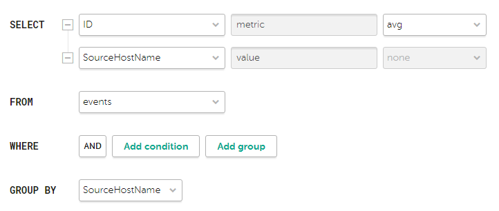
Search condition parameters for the widget showing average bytes received per host
- SELECT—use these fields to define event fields that must be extracted for analytics. The number of available fields depends on the selected widget graph type (see above).
In the left drop-down list you can select event fields from required for analytics.
The middle field displays what the selected field is used for in the widget: metric or value.
When the Table widget type is selected, the values in the middle fields become available for editing and are displayed as the names of columns. Only ANSII-ASCII characters can be used for values.
In the right drop-down list you can select how the metric type event field values must be processed for the widget:
- count—select this option to count events. This option is available only for the ID event field.
- max—select this option to display the maximum event field value from the event selection.
- min—select this option to display the minimum event field value from the event selection.
- avg—select this option to display the average event field value from the event selection.
- sum—select this option to display the sum of event field values from the event selection.
- FROM—this drop-down list is used to select data source type. Only events option is available for selection.
- WHERE—this group of settings is used to create search conditions:
In the left drop-down list you can select the event field you want to use as a filter.
In the middle drop-down list you can select the required operator. Available operators vary based on the chosen event field's value type.
In the right you can select or enter the value of the event field. Depending on the selected event field value type, you may have to input the value manually, select it in the drop-down list, or select it on the calendar.
You can add search conditions using the Add condition button or delete them using the button with the cross icon.
You can also add group conditions using the Add group button. By default, group conditions are added with the AND operator, but you can switch the operator between AND, OR, and NOT by clicking the operator name. Available values: AND, OR, NOT. Group conditions are deleted using the Delete group button.
- GROUP BY – this drop-down list is used to select event fields to group events by. This parameter is not available for Counter graph type.
- ORDER BY – this drop-down list is used to define how the information from search results must be sorted in widget. This parameter is not available for Date Histogram and Counter graph types.
In the left drop-down list you can select the value, metric or event field to use for sorting.
In the right drop-down list you can select the sorting order: ASC for ascending or DESC for descending.
For Table graph types it is possible for add sorting conditions using the ADD COLUMN button.
- LIMIT—this field is used to set the maximum number of data points for the widget. This parameter is not available for Date Histogram and Counter graph types.
- SELECT—use these fields to define event fields that must be extracted for analytics. The number of available fields depends on the selected widget graph type (see above).
- SQL query—this tab contains a field to enter a search query equivalent to filtering events using SQL syntax.
- Builder—this tab contains the event search query parameters equivalent to event filter builder parameters:
The following parameters are available for the tab:
- The Y-min and Y-max fields are used to define the scale of the Y-axis. The Decimals field on the left is used to set the rounding parameter for the Y-axis values.
- The X-min and X-max fields are used to define the scale of the X-axis. The Decimals field on the right is used to set the rounding parameter for the X-axis values.
- Line-width and Point size fields are available for Line chart graph type and is used to configure the plot line.
The following parameters are available for the tab:
- Name—the field for the name of the widget. Must contain from 1 to 128 Unicode characters.
- Description—the field for the widget description. You can add up to 512 Unicode characters describing the widget.
- Color—the drop-down list to select the color in which the information is displayed:
- default—use your browser default font color.
- green
- red
- blue
- yellow
- Horizontal—turn on this toggle switch if you want to use horizontal histogram instead of vertical. This toggle switch is turned off by default.
- Show legend—turn off this toggle switch if you don't want the widget to display the legend for the widget analytics. This toggle switch is turned on by default.
- Show nulls in legend—turn on this toggle switch if you want the legend for the widget analytics to include parameters with zero values. This toggle switch is turned off by default.
- Decimals—the field to enter the number of decimals to which the displayed value must be rounded off. The default value is auto.